Sunday, 12 August 2012

Hats wigs and facepaint

The fact that Germany beat Netherlands 2-1 in the Men's Olympic Hockey final yesterday has completely defeated my theory that the result was predetermined by the proportion of spectators turning out in national colours. Take the preliminary match I watched last week when Netherlands beat New Zealand. The stands were a sea of orange. Synthetic orange wigs and brightly coloured jackets were everywhere.


Supporters from the first match were still shouting Ozzie Ozzie Ozzie but black was nowhere to be seen other than on the pitch. The result? 5-1 to Netherlands. I was hopeful then when I saw plenty of red white and blue wigs as well as masses of facepaint in the union flag colours amongst the bronze medal match spectators yesterday. Sadly a result for TeamGB was not to be. Australia were the better team on the day winning 3-1. The green and gold hats, though definitely in the minority, were jubilant!

Netherlands 5 New Zealand 1

When I applied for tickets to the Olympics over a year ago it never occurred to me what an early start would be needed to get to the stadium by 8:30am. However the one pair of tickets I managed to get out of the ballot was to see the morning session of Hockey in the Olympic park itself and I wasn't about to turn down the opportunity. The feared security queues didn't materialize but it still took over 2 hours door to door from Surrey having left home a little before 6am. 
Bakker scores to make it 3:1

 By lunchtime we'd sat through 3 seasons of English weather, getting frozen, sunburnt and finally drenched, but we'd seen some superb hockey: Australia versus Argentina and New Zealand versus Netherlands.

Wednesday, 1 August 2012

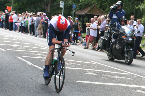
Wiggins Wins Gold

Can there ever have been so many people lining the streets of Surrey as for this week's Olympic cycling events?

Bradley Wiggins (Gold)

Chris Froome and Bradley Wiggins were amongst the last few riders today and you could hear each of them approach by the roar going up from the crowd.

Chris Froome (Bronze)
Today's cycling time trials  had  brought out the crowds in their thousands at Hampton Court, and where I watched the race, teamGB's supporters were stretched along both sides of the road as far as the eye could see. There were flags being waved everywhere and a general mood of anticipation for Bradley's success, fed by onlookers with smartphones keeping us up to date with the unfolding action further on up the course.

After the last competitor had passed I  squeezed through the throng making their way on foot or by bike back home or to cars parked all along the road leading up to the A307. This quiet leafy lane was unrecognizable from its usual mostly tranquil self. I made it  in time to see the finish and  see Bradley Wiggins and Chris Froome collect their gold and bronze medals respectively.  What a day!


The dash home to see the finish


Saturday, 28 July 2012

40 seconds from Gold

I watched the men's Olympic road race today and briefly glimpsed team GB as they raced through Oxshott, still leading the peloton.

They were still around 50 seconds behind the leaders at that point and the riders were all going so fast that it seemed an impossible dream that they could catch up in the remaining distance. The eventual 40 seconds between  Mark Cavendish and  the winner,  Kazakhstan's Alexander Vinokourov, sounds like nothing until you've stood on the street and experienced just how far they ride in that short space of time. I'm truly in awe!

Following the Torch

I've often whistled through the various stops en-route to Waterloo but  on day 66 of the torch relay  I found myself standing on the pavement not far from Earlsfield station, mingling with young families eagerly awaiting the torch's arrival. There was a carnival atmosphere as a steady procession of Samsung quad bikes, police motorcycles, the torch relay bus itself and a variety of open top buses belonging to various sponsors made its way South. There was waving of flags by those taking part in the procession, both in the street   and on top of the buses.

Onlookers waved miniature flags and photographers from the world's TV channels attempted to capture the sights with enormous camera equipment. Their efforts may have been more professional but the pictures from the onlookers will hold lasting memories.


Saturday, 21 July 2012

Ticket Machine Blues


Yesterday I missed my train. I could blame myself for not leaving more time. I could blame my own meanness for not parking in the station car-park, still charging a flat  £5.30 at 3:30 in the afternoon when a town car park a 5 minute walk away charged £1 for the two hours I needed. I could even blame my own stupidity for not realising that the booking office was in fact open if I had entered the station from the opposite side. Most of all though I blame the fact that the platform-side ticket machine was in full sunlight. Its display could barely be read and the family in front of me wasted all the time remaining repeatedly having to start again when they pressed the wrong button. They gave up in the end but by that time it was too late. I could see what the problem was instantly when I made the same mistake. The button that appeared in the sunlight to be confirming the station selected was in fact asking you if you wanted to depart from a different station. No wonder they were confused.


Not only do ticket machines at out of town stations needed to be located better, they also need to be more plentiful. At my nearest station, not the one I used yesterday, there is only one, similarly sited with the same problems in the afternoon sunshine. I could have bought my ticket in advance and collected it from the machine but I'd still have had the same usability problem. We live outside the Oyster card zone so using such ticket machines for spur of the moment journeys is the only option when the booking office is closed.


I first looked at the usability problem of forecourt ticket machines a couple of years ago as part of a Human Computer interface project, so I'd be the first to admit that creating a more usable interface is not an easy task.  Smartcard ticketing may be the answer but not everyone will opt for this. A redesign of the machines to incorporate a barcode reader to read a mobile phone display so prepaid tickets could be collected with the press of one button would have solved yesterday's problem though.  Surely that can't be so difficult?

Thursday, 22 July 2010

Monitoring of web traffic on an online banking site. Risk or legitimate data collection?

LloydsTSB has redesigned its online banking service web site and I tried this out for the first time yesterday. The site, as well as displaying statements with the newest transaction at the top, claimed to have introduced new features which would make it easier for the user, but my own first impressions were far from favourable.

For a start there was a new quick payments page. They had provided a drop-down list of the recipients I had already set up. Paying one or more of these just entailed making a selection from the list and then choosing the amount and confirming the password as before. A link then enabled me to return to the same page to make another payment if I wished. Initially I assumed that this drop-down list had replaced the previous page of links and since it didn't include a reference number, though unhelpfully did include an 8 zero account number for credit card companies, I had an immediate problem as I had more than one account with the same institution. These had the same sort code and zeros account number. There was no way to distinguish between the two without the reference.

After a 10 minute wait on the online banking telephone helpline I was told that the old payments page could still be reached and I could make my payment there. This was true but there was no link back to it, so the process was going to take longer than before for multiple payments. This was supposed to be an improvement? Additionally the make payment and delete recipient buttons were very close together on different lines and I could see that deleting a recipient by mistake would be all too easy.

I've focused so far on usability, but a far more serious issue for me was the fact that the site momentarily redirected to statse.webtrendslive.com en-route to each new page. I eventually discovered that LloydsTSB are collecting marketing information in this way, but not until after I had wasted a considerable amount of time talking to technicians at an anti-virus software provider. They weren't knowledgeable enough and wanted to solve a non-existent virus problem with a sledge hammer approach. I'm always wary about researching viruses on the net as malicious sites can themselves introduce viruses whilst purporting to offer software to remove them. I did find discussions of webtrendslive on various forums though and once I had realised what was happening it was easy enough to block it using a Firefox add-on.

It's a shame that when asked, LloydsTSB's helpdesk staff only said that the presence of webtrendslive in the status bar was part of the workings of their website and didn't confess it was a 3rd party site. This kind of redirect is not what you expect in online banking and doesn't lead to confidence in the security of the site. When I also explained the usability problems the new site was causing, the helpdesk also didn't seem to think that an extra click to make multiple payments was an issue. "It's only one more click" they said. I suggested a new link would help, back to the payments page. It's a pity too that the choice of display order isn't set as a user preference as I'm sure not everyone will like this feature. The helpdesk promised to pass my comments on but I'll never know if they did. It would have been good to have been able to send the feedback to the right department. Someone there might have been more interested.
 
visit counter: Add to Technorati Favorites